
This is a model of an IELTS bar graph. The topic is team scores.
Example 7
You should spend about 20 minutes on this task.
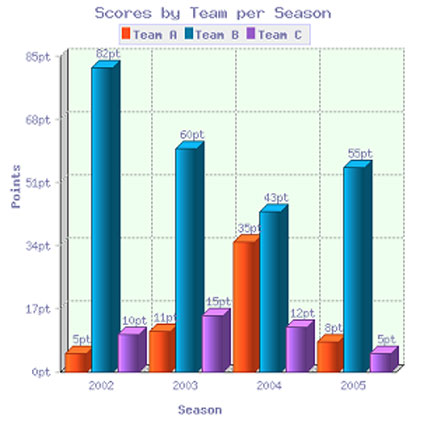
The bar chart shows the scores of teams A, B and C over four different seasons. Summarize the information by selecting and reporting the main features and make comparisons where relevant.Write at least 150 words. |
IELTS Bar Graph - Model Answer
The bar chart shows the scores of three teams, A, B and C, in four consecutive seasons. It is evident from the chart that team B scored far higher than the other two teams over the seasons, though their score decreased as a whole over the period.In 2002, the score of team B far exceeded that of the other two teams, standing at a massive 82 points compared to only 10 for team C and a very low 5 for team A. Over the next two years, the points for team B decreased quite considerably, dropping by around half to 43 by 2004. In contrast, team A’s points had increased by a massive 600% to reach 35 points, nearly equal with team B. Team C, meanwhile, had managed only a small increase over this time. In the final year, team B remained ahead of the others as their points increased again to 55, while team A and C saw their points drop to 8 and 5 respectively.
(Words 168)
No comments:
Post a Comment